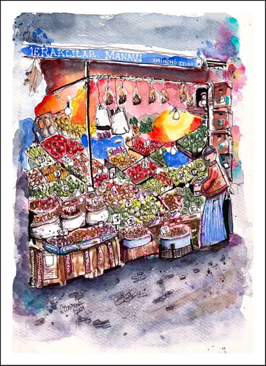
Istanbul Fruit & Veg Stall - DTIYS Challenge Sketch
INSTAGRAM EXTRASTIPS & TUTORIALS
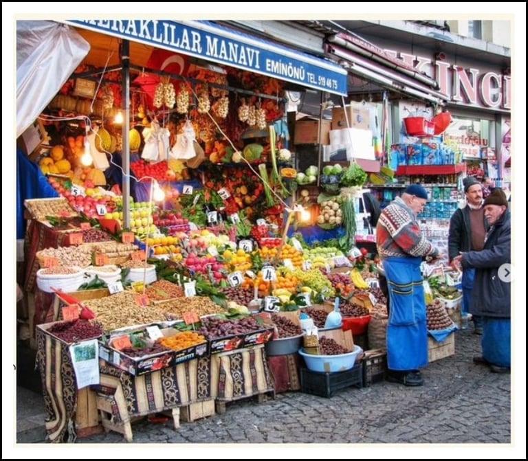
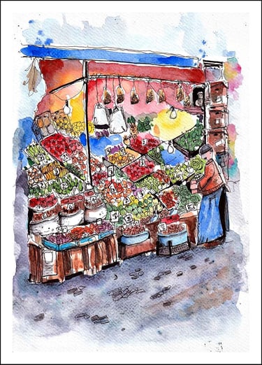
Photo by Jay @new2paintingat60


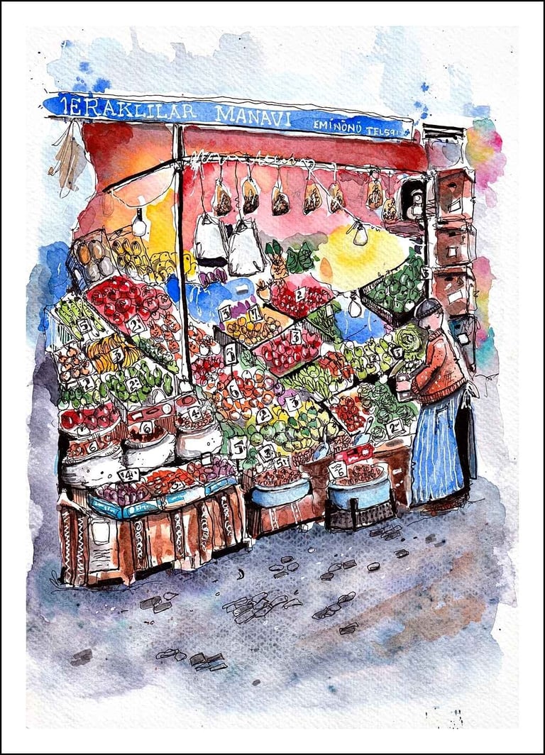
My step by step process for this Instagram DTIYS Challenge
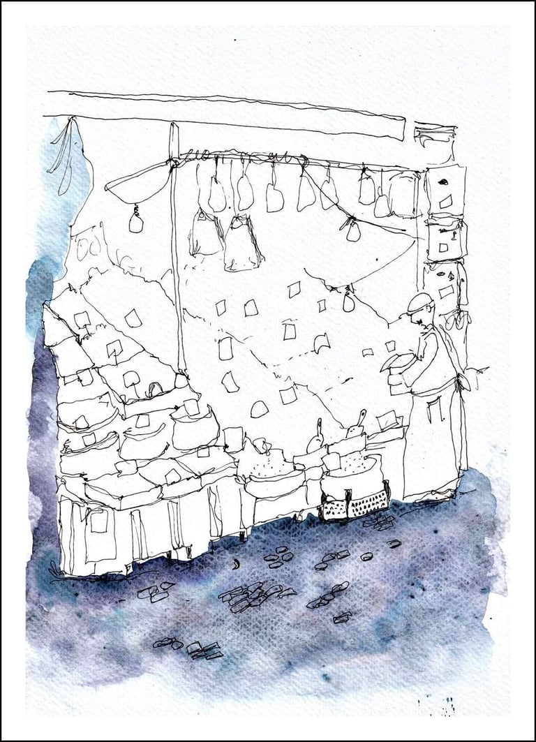
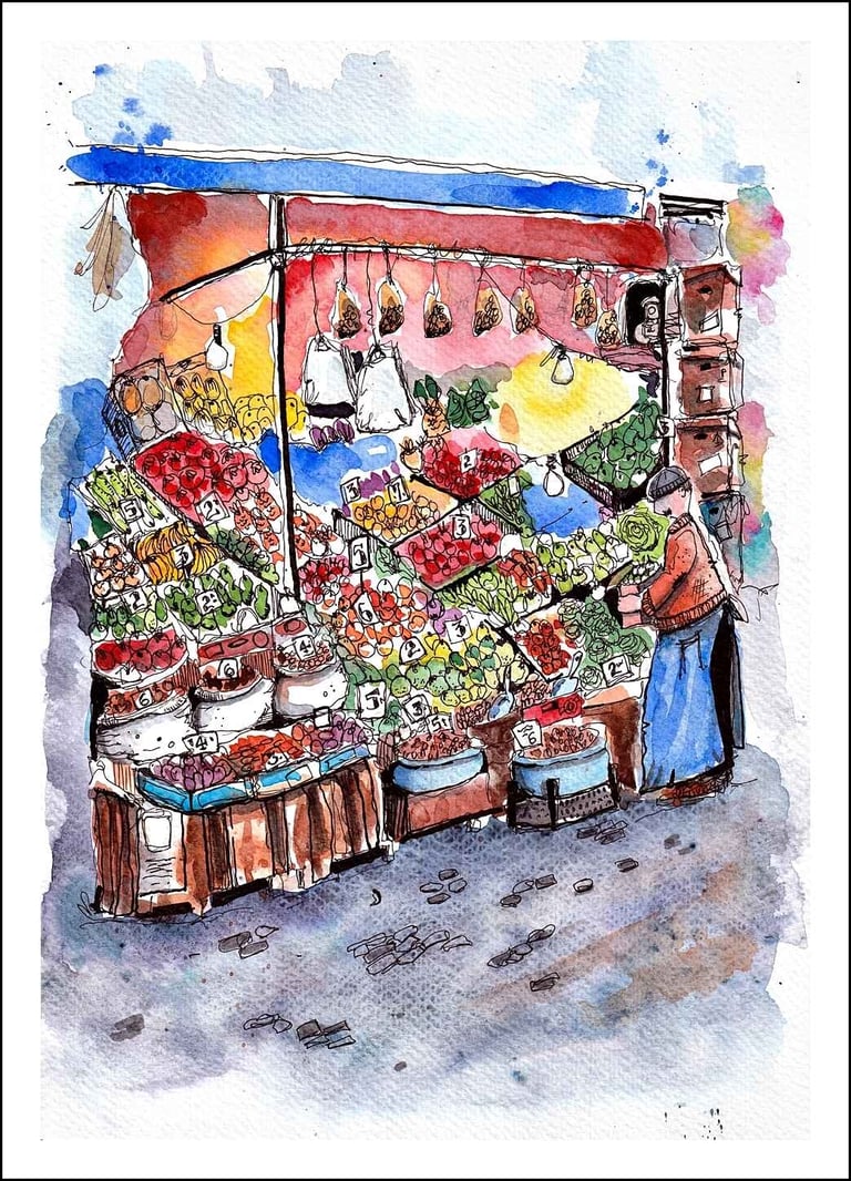
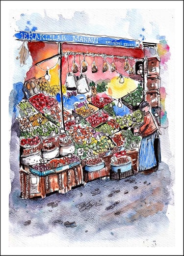
My finished sketch
In this post, I will be sharing my step-by-step process and thoughts on how I tackled this challenge, in which I am privileged to be a co-host with my fellow Instagram artists, Jan @trinketsetc and Jay @new2paintingat60
This post will be broken down into the following bite-sized chunks, which I hope will help or inspire you should you decide to join us in this challenge.
Before the sketch
Pencil & pen outline work
Adding the first colour
Adding background colours
Painting base colours & shapes
Sketching the details
White pen details
Before the sketch
Before I even consider putting pen to paper I'll look at the reference photo and make a list of things that what I want to include in my sketch. I will also have a good idea in my mind's eye of what style I'll be using.
To keep these sections short and sweet, here is a list of what I saw and what I wanted to include. At this stage, you can also decide what NOT to include, which is equally important.
The sign at the top of the stall
The bright colourful areas created around the hanging lights
All the little price signs dotted around the stall
The hanging bags of food and plastic carrier bags
The scoops and the blue tubs at the front of the stall
The patterns on the textile cloth covering the stands at the front
The stall holder without the customers
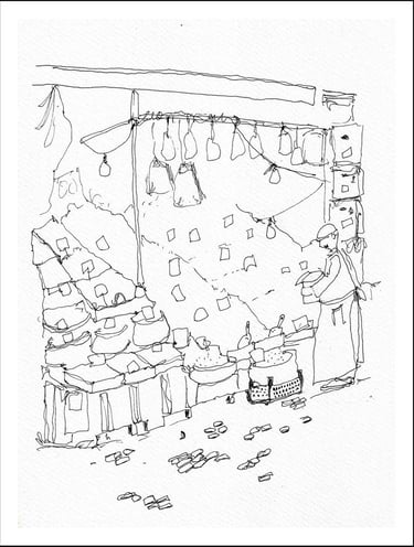
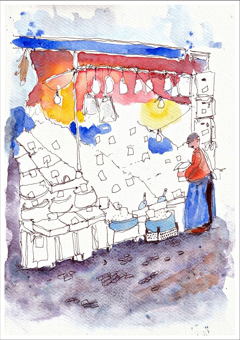
Step 1. Pencil & Pen outline.
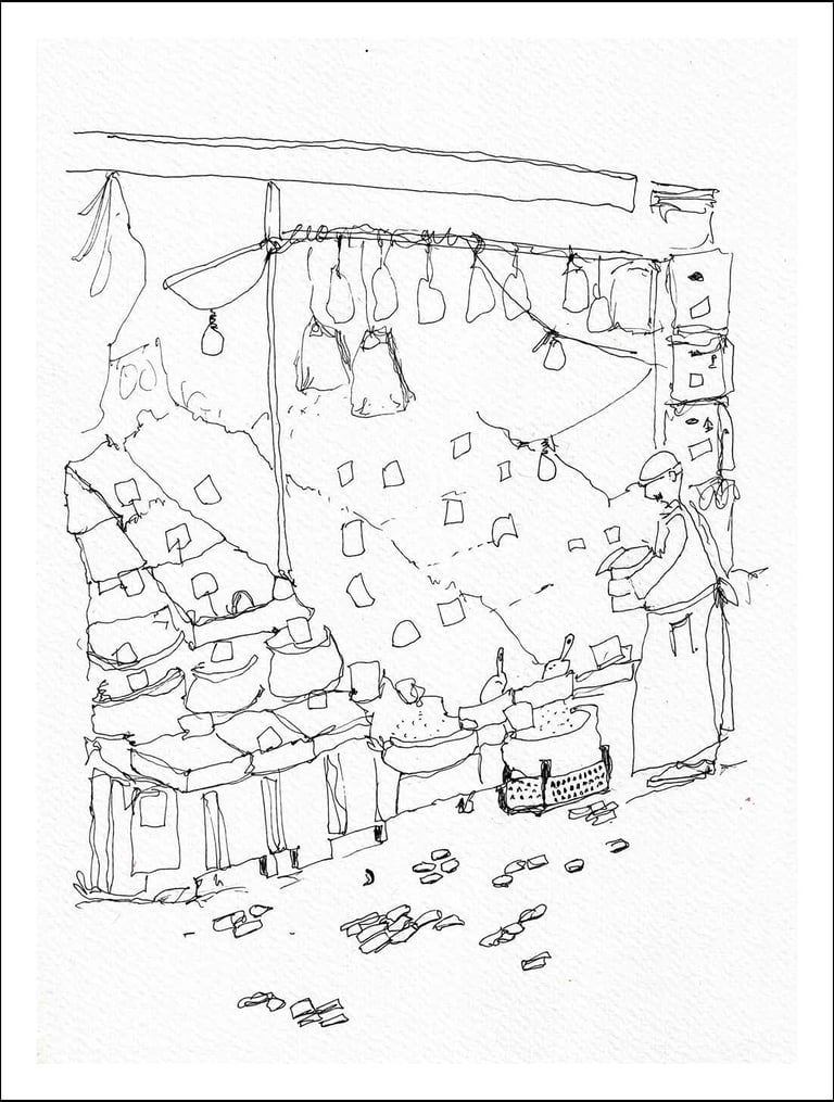
I forgot to scan the rough pencil outline before adding the ink, but I basically just went over the pencil lines, and after the ink had dried, I erased the pencil marks.
I have no fast rule about sketching first in pencil and then adding the pen work on top. It all depends on what I'm doing. For example, I'll doodle quite happily in ink, and if anything evolves, I'll add paint to finish it off.
For scenes like this, where there are a lot of objects and details to fit in, I'll do a quick pencil sketch, just to make sure I have everything roughly in its correct place.
I chose to only include the stall holder in my sketch because, in the photo, the other two men were too far from the edge.
As for the stall holder himself, he was looking away from the main area, but I think that turning him around and having him do something helped tell the story of a market greengrocer at work.
My Tips.
Don't add too many details at this stage; just create the areas where details will be added later.
Mark out any white areas that you want to preserve, such as the price labels, light bulbs, and hanging plastic bags.
Just add a few suggestions for cobblestones. If you add all of them, then those details could distract the viewer's eye from the main area of focus.
If you are not confident in adding figures, that's fine. Don't stress; just leave them out and concentrate on creating a fantastic main area.
For this sketch, I used an A4 sheet of Winsor & Newton 25% cotton watercolour paper and a 0.35mm waterproof gel pen for the outline sketch.
Step 2. Adding the first colour.
I find that when adding the first color, I like to start with a large area. It's a bit like doodling random shapes for a few minutes before starting a sketch, just to get warmed up. Although I never warm up before sketching, I'm too impatient.
By getting that large area of paint on the paper to start with, it gives me a sense of 'beginning', where a little voice in my head says, 'here we go'.
I recently purchased a box of White Nights granulation watercolours which I love! Combined with the structure of this watercolour paper, the effects it produces on the road surface do a great job of conveying texture without having to sketch each stone.
My Tips.
For areas such as roads or building facades where you want a rough and random texture, try using the 'wet in wet' technique, adding a few different colours here and there to create more interest.
Don't forget to check, and if necessary, change your water, as these dark colours may kill the vibrancy of your bright colours in the next stages through contamination.
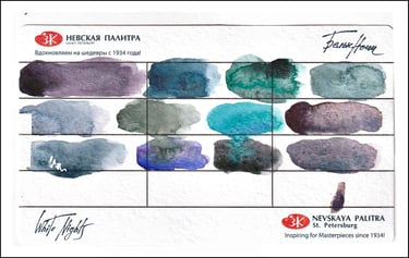
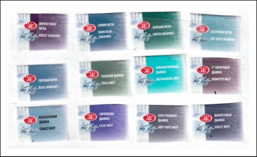
Swatches and labels from the White Nights granulation paints.
Step 3. Adding background colours.

When it comes to adding the background colours in this early stage of the sketch, I'm basically mapping out what colours go where.
I'm not aiming for the finished product just yet, but I merely want to see how some colours work with each other on the page, and also by laying down an 'under painting' will help boost the colours in the final stages.
My Tips.
Because I was scanning each stage of my sketch for this post, I had to wait for the paint to dry before moving on to the next one. If, however, you are like me and you just want to keep going because you are in the zone, then make sure you work away from the areas that are still wet to avoid unwanted mixtures on the page.
Again, if you haven't changed your water by now, then it's probably about time to do so.
Step 4. Painting base colours & shapes.
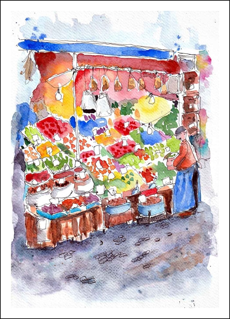
This is where the fun for me begins. I love details and experimenting with how to create certain details for various objects and textures.
I started with one colour, red, for example, and I painted a few of the boxes with a light mix of paint. I then added a few dabs of a stronger mixture of red to create the random shapes of the fruit and veg.
I carried on with this process using various colours and shapes until the stall and surrounding items were at the desired stage of completion.
My Tips.
Try changing up the methods of applying your paint marks to help establish a varied mix of shapes and shades by using both the 'wet on dry' and 'wet on wet' techniques.
Try to avoid those unwanted paint runs between the areas by leaving enough drying time or space. This will help preserve the shape of the baskets holding the produce.
Try to avoid painting over the white areas saved for the prices.
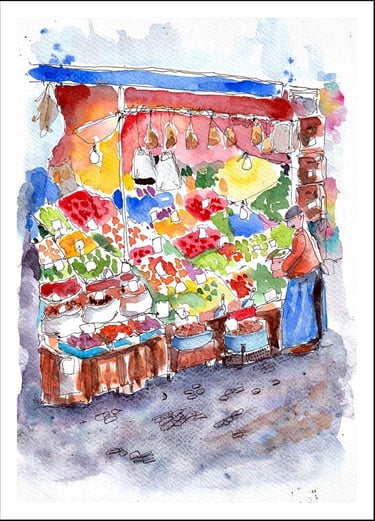
Step 5. Sketching the details.
It was now time for me to get busy with my pens.
I used a selection of pens, ranging from my 0.35mm gel pen for the fine details and shapes, my Uniball 157 rollerball pen for more defined lines, and a 1mm marker pen for slightly larger areas, such as the guy's trousers, the metal poles holding the hanging goods, and the dark shadows under the front of the stall.
I added some little shadows to the fruits and vegetables with a medium grey marker to give them some depth and volume.
My Tips.
Try to vary the shapes and sizes of the fruit and vegetables to promote more interest.
Add different leaves and markings to the goods, again to give the viewer more details to get lost in.
Not everything costs the same, so have fun sketching different values and trying out a new style of font while you are at it. I enjoyed doing the good old British style of numbers.
Step 6. White pen details.
We are almost there, and all that is left are the final bits and pieces to top it all off.
A white gel pen or white gouache is always a must for me in these final stages. I don't have a preference between the two, but I find a white gel pen for simple signage much easier to use.
If I had a large Coca-Cola sign, then I would probably use white gouache to cover the large white areas and a pen for the finer details.
I dabbed some highlights on the fruit and vegetables with my pen, and I use that too for the name of the stall on the canopy.
The details in the fabric draped over the boxes at the front were too complex and not that important to me for this sketch, so a few random squiggles were enough to show my viewers that this was fabric, not wood.
My Tips.
I'm a fine one to talk, but try not to overdo it with the white pen or gouache, as this could overpower the feel of the scene.
Have a look to see where you could add extra designs or shapes of interest with the white pen, such as the stripes in his apron or some white labels on cardboard boxes.
Step 7. The final touches.

Thank you for making it this far, I'm almost done.
Once I'm done with adding the details and the white pen markings, I take a look at my sketch to see where I can add some finishing colours and contrast.
I have placed the previous stage on the left so you can see and compare where I've added extra colour and contrast to my final piece.
The top of the sketch was a bit too open for me, so I added some indigo using the wet on wet technique to close it off and use it together with the bottom of the sketch as a 'frame'.
The areas around the light bulbs were a good excuse to add some more vivid colours to the scene, and with the addition of some more indigo paint around the bottom of the stall, my sketch was done.
All I had to do was sign it and let my little mouse loose.


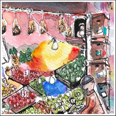
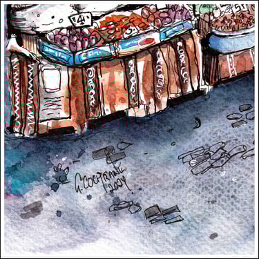
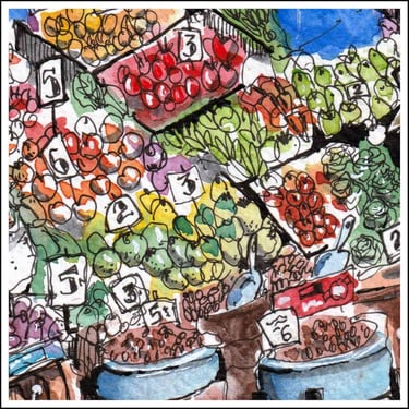
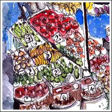
A few close up selections from my sketch showing some of the details and textures.
click a pic to scroll through the gallery
Close up gallery
Conclusion
To conclude my very first 'tutorial' post I'd like to go over a few points that I hope will help you in tackling this challenge and also in any future art projects or challenges you take on.
Look closely at your reference photo or real-life scene and decide what you want to include in your sketch and also what you don't want to include.
Sketch a rough outline in pen or pencil; the choice is yours. Don't get involved with details. Preserve any white areas you will need later on.
Laying down a large area of colour to start with breaks the ice and gets you into the 'zone'.
Add basic colours to the background to map out where things are going to go. If you want to keep areas defined, be conscious of painting next to areas that are still wet.
Paint the areas of colours and add extra paint details using the wet-on-dry and wet-in wet techniques for a variety of shapes and textures.
Use various sizes of pens when adding the details for a varied line weight in your sketch.
White gel pens or gouache are great for adding attractive signage, highlights, and reflections; just don't overdo it.
Take a look at your sketch when you think you are finished to see if you could improve on any areas of colour or contrast.
One great tool that we all have but cannot buy is 'Artistic License'. Use it when you need to, and enjoy the process of creating your art.
Do you have any tips, tricks or techniques you would like to share with us?
Your feedback is important
Thank you very much for visiting my blog, and I hope you enjoyed my post.
To enable me create more content of interest and quality in the future, please consider filling out the feedback form below.